My front cover:
http://docs.google.com/fileview?id=0B4-5YKV5LgbpZWFlNzhjODgtOGMwOS00Y2YxLTg1M2QtY2VjMWMyYzE4ZTBi&hl=en
My contents page:
http://docs.google.com/fileview?id=0B4-5YKV5LgbpYzI0YjMzOWEtMjEyMi00Nzg1LTljYmQtMzg1Y2YzZDEyOWRl&hl=en
My double page:
https://docs.google.com/fileview?id=0B4-5YKV5LgbpYmI4MmU3OGYtYzNiMC00NjdlLTliZmQtN2Y3NmMyYTA0ODQy&hl=en
For my Hip-hop magazine Rap Sheet I chose a bold and stenciled type of font which I think gives an urban feel and stands out well to attract my target audiences attention (woman and men aged between 16-34). The Source magazine which is the same genre uses a similar font. See image below.

I feel my Hip-hop magazine is different to other types of music magazine as it is not targeted at one sex, it is suitable for men and woman and the age group it appeals to is quite vast (16-34year olds) Also my magazine doesn't conform to any kind of layout or grid, I tried to make the layout quite free but at the same time easy to read as I feel this would appeal to my target audience more than a very boring simple grid method on each page.
My magazine is similar to other magazines though in that my masthead is similar to for example The source and Vibe magazines and my main image is large and of one person making eye contact to catch the viewers attention, which is similar to other music magazines. I felt I should make a few similarities to other magazines as people like to see something familiar to relate to but also these types of idea-making the model have eye contact are the best way to catch attention.
I feel my magazine represents 'Hip-hop' fans well as it is quite open to anyone and the articles I have made would appeal to (16-34 year old men and woman) who are my target audience. Young people are often perceived as dangerous or not to be trusted but I feel my magazine represents the age group and the genre of music well. The images I have used are firstly of a mixed race attractive young woman which I feel would attract the attention of my intended target audience and Hip-hop lovers, I have also taken pictures of the highly popular game DJ Hero which has a range of hip-hop styled music on it which would also attract my target audience (woman and men aged between 16-34 who enjoy Hip-hop music)I feel my magazine isn't discriminant of race or sex as I have used a mixed race young woman on my front cover and on my contents page and my target audience is woman and men.
My magazine has turned out to be more attractive to younger people rather than my preferred target audience of 16-34 year olds. Which I didn't mean to happen as I am not discriminant to age but because of the industries influence on magazines I have had to try and make my magazine fit under the popular bracket of (young attractive models with good figures, the type of text I have had to use and the articles I have used) I had to do this as it's more common that someone will get attracted to a young, fresh looking magazine and with the youth of today being the most likely to buy magazines rather than older people as they have more money to waste.
I think that the images and text I have used suggest fun and excitement about my genre of magazine and that Hip-hop isn't always bad or to do with gangs etc which a lot of people think. It is also very cultural, showing not only one culture. Real Hip-hop artists rather than the commercial artists have a love for the type of music where as commercial artist have a love for the money rather than the music, which you can tell when listening to the music. I feel that I have been fair and not on a particular side of Hip Hop like the new commercial artists or the older ones, as my magazine doesn't mind commercial or old Hip Hop artists.
I would use a big publisher for my magazine like Vibe magazine does, they use the Time Warner publisher which I would use, as Vibe was very popular and must of had a lot of help from a big publisher. I feel to make my magazine big and get it out I would need to use a large and well known publisher like Time Warner. This is their website: http://www.timewarner.com/corp/
I would get Major shops like WHSmiths, Tesco's, Sainsburrys etc.. to stock my magazine as this is where many of my target audience (woman and men aged between 16-34) would shop and see my magazine and I feel this is the best place to try and sell a magazine as it is more likely to be bought and liked if it is sold in a familiar, well known place. I would also stock it in specialist record shops as I want my magazine to look professional and important and that the music is important to the magazine. I feel these places would choose to stock my magazine as it is well presented, it represents the genre Hip-hop well and there aren't many Hip-hop magazines around, especially that will give you the culture and the music.
Th audience for my magazine are woman and men because I like to be equal and for my magazine to attract and please both sex's, The age group I aimed for was between (16-34 year olds) which I feel is quite vast so I am not being discriminant to age or sex. The type of race of the person that would buy my magazine wouldn't be a particular one but may be slightly more towards African and darker coloured people with some Caucasian people. The socio-economic group of people that would buy my magazine may vary between B-middle class, C1-Lower middle class, C2-Skilled working class and D-working class as my magazine is representing a type of music which many different types of people enjoy and follow.
I tried to attract my audience (woman and men aged between 16-34) by using informal language with slang and words that are easy to read, as younger people prefer this way of speaking and feel more comfortable reading something that is for them.
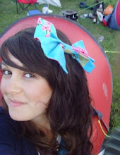
The image I chose for the front cover was chosen to attract my audience as the model is a young, attractive woman who both male and females like to see, as males may feel drawn more to a good looking person and woman the same but may feel they aspire to look like the model or connect to the model in some way. The models pose is also used to draw in my target audience as she looks comfortable, confident and proud which draws people in as they aspire to be like that person or they respect them more. The image on the left is the image I used for my front cover below and the image on the right is another example of an image I used in my magazine.

The type of text I used for my magazine for example the title is also used to attract my target audience as it is similar to other Hip Hop magazines that are in the market that have the same target group as I do and my target audience chose the text in a questionnaire I gave to them. The other magazines in the market that I looked at for inspiration where The Source and Vibe magazines, these are examples of their front covers below..


After constructing this project I have learnt a lot from technology such as Adobe InDesign and Adobe Photoshop. For example I had never used InDesign before I started this project, I now enjoy working with the programme and feel i understand it more although I still have a lot to learn. This differs from my knowledge of Photoshop, as I luckily had used this programme before, doing photography which really helped me with this project as I feel my images look much better than they would without any re-touching or editing. I found that both programmes where very useful and fun to use once I got to know them. I am looking forward to learning more about both programmes in the future and hope to work on them again very soon.
InDesign and Photoshop helped a great deal in my idea process as they made many of my ideas come to life without too much difficulty, for example when I wanted to make my model look fresh faced and have no spots or blemishes I just used photoshop to help me do so. Another example is when I wanted to have a black background on every page of my magazine InDesign made this very easy for me.
I don't feel any of my ideas where compromised by the software as I am very happy with my final product and both software's worked very well together.
Looking back at my preliminary task I feel I have made huge improvements and have learnt a lot from the progression from it to my final product.
Elements of my design skills would be that I have a much greater knowledge of using both software's than I did at the very beginning and I have been able to think in a way that would suit the software I used to complete my final magazine.
I feel my language use is much better in that it suits my target audience of woman and men who enjoy Hip Hop aged between 16-34.
I planned much more thoroughly than I did for my preliminary task as I knew that this task was much more important and I had some knowledge of what was expected of me than I had at the very beginning of the course.
Overall, I am very happy with my final outcome for this project and I am looking forward to doing more in the future.
No comments:
Post a Comment