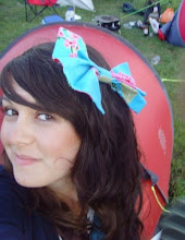
These are the two images I shot for my front cover.
I chose the larger image as i thought it stood out the most because of the hand gesture the model is showing and the cheeky expression on her face as well as the red lipstick which attracts my target audience (16-19 year old students).
I decided not to use the smaller image as I felt it wasn't as strong as the first image and didn't go with my colour scheme -Red, i also don't like the pose in this image.
I chose red as my colour scheme as it stands out and catches people's eye, it's daring, cheeky and stands out.
I like the angle of both the images as the shot is not exactly straight on to the viewer, I feel this draws you in and the focus of the models eyes are right into the camera which attract attention. The red lipstick used in the final image i chose catches your eye subtly and ad's interest to the image, I feel the clothing I chose for this image was good as it is a neutral colour and doesn't distract the viewer from the main image and the magazine cover.
The hand gesture in the final image I feel completes the picture, its cheeky, young and fun to attract the target audience and it balances out the image.
The image being of an attractive female attract both female and male sex's as you see women on male and female magazine front covers.
I chose to shoot a medium close up as it is the norm in real magazines and people like to see familiarity.