Friday 27 November 2009

Photo's


These are the images I shot for the front cover, I rented the college studio for the shoot and decided to use a black background as I felt it would be more effective and interesting tonally, I feel the black background worked to my advantage and if i have used the white background it would of been too bright and have no feeling or softness on the models faces.

I decided to use two different models to increase my chances of getting a really good shot that really suited my genre (Hip Hop) and would look good as a cover image.

The clothing the models are wearing is very simple Black clothing, I wanted the models to stand out more than the clothing. Most Hip Hop magazines have half naked woman on the covers, as I am a girl I didn't want my magazine to promote or show these kinds of images, I concentrated on the models beauty rather than their bodies. The models are wearing very subtle make up I think this helps to show their natural beauty rather than a fake beauty, They also look strong and confident and a bit subtly sexywith the poses they are doing or a slightly open mouth, these subtleties I find are much more appealing to men rather than a half naked woman looking intimidated and shy. In the end I decided to use the 4th image of the models as the image stands out the most, has the best lighting and composition and the model suits the genre of my magazine by looking more urban because of her ethnicity and the clothes she is wearing for example her hooped ear rings.I find technically this image is the best with composition, lighting and tones etc.
I took around 220 pictures for my front cover, these images above are my best shots.


These are images I took for my double page spread, these are only a selection of the best images I took. I took 37 images for my DJ HERO review page in total.

I took images of the game deck, the game box and images of the video while the game was playing. I feel the images I picked were the best ones out of the ones I took and that they work the best to show the game off to my target audience woman and mean aged 16-34.


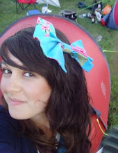
These are a few of the images I shot for my contents page. I liked doing this shoot as it was fun and natural, the model wasn't wearing much make up and it didn't take very long to get some good images. I used two images of this model on my contents page and one of the game, to promote and advertise the article of the review on the DJ Hero game.
In all of the images I chose for my magazine I decided to be subtle when shooting, the costumes I used were plain colours: black and white, I find that this helps the viewers eye's to look at the model rather than getting distracted by their clothing.
I didn't use any props in my photographs as I like them to be simple and stand out more.
The lighting I used for the studio images was just from the studio lights, which I had to keep moving around to get the best image.
I didn't get my model's to pose very much I just let them pose naturally as I feel their faces and body language will look more relaxed and pleasing to the eye.
I made sure that my model's filled the frame as much as possible to make the viewers attention go straight to my models rather than get distracted by the background.
I think everything that I chose to do reflects onto my magazine well, although in some Hip-hop magazines props are used and big gold jewellery is used but other than that I think my images suit my genre well.
I feel my images will appeal to my target audience (woman and men aged 16-34) as the woman in my magazine is young and attractive looking. She suites my Hip-hop genre with her urban look.

Tuesday 17 November 2009

Fonts


These are fonts I found on the website (dafont.com) I chose them all as I thought they suited my genre of (16-34 year old woman and men).

My favourite fonts are no 1, 5 and 7 as I feel these all suit my target audience well and I think they are attractive to the eye and suit my genre of magazine-Hip Hop.

I asked 6 different people to vote on the fonts and numbers 1, 5 and 7 were the most popular, I told the voters the genre of my magazine and who my target audience where, so they voted for the font that would suit my specifications the most. Font no. 7 came out the most popular, i think this is the font I will use as i like it and the feedback was good for it.

I chose these fonts as they all have an urban feel and I feel will catch the attention of my target audience (16-34 years old women and men).

The name Rap Sheet was chosen as Rap is an urban type of music and sheet is where you write music. But I also chose this name as it means someone taking the blame for you 'taking the rap'.

I feel some of the fonts above are quite similar to the Hip Hop magazines I analysed for example Vibe's font is large and bold and has an urban feel.

All of my text that I will use for my magazine will be in sans serif typeface as I feel this is more appealing to my target audience women and men of ages 16-34, this is also easier to read and easier on the eye.

The font that I have decided to use is font 7 as it has an urban feel, it's easy to read and It will stand out and catch my target audiences eyes, it is quite similar to Vibe's style of font in the boldness, colour and urban feel but it is different in the shape and print, i have decided to use a white text as it will stand out on my black background. The Source's Title font is similar in boldness and urban style but the use of colour, shape and outline are very different to the font I have chosen, I feel this is good as my magazine will be different to find a gap in the market but will also have a few similarities as people like to see familiar things. I found the font on a website called 'dafont.com' where you can download fonts for free, the font I chose is called 'capture it'.

Front Cover fonts

I have used many different sizes of text, the Title of my magazine 'Rap Sheet' is the largest in size at (100pt) as this is the most important part of text on my front cover, my target audience (woman and men aged between 16-34) need to recognise my magazines name and new readers need to have their attention caught to make them interested in my magazine. The name of the text i used is called 'Capture it' text from the website dafont.com.

The text line attention grabber above the title of my magazine is there to capture my audiences attention and to show the magazine is proud to say it is one of the best around, This text is greatly smaller at (30pt) than the title as it is not as important, but it still stands out in bold white text as it is important for the reader to see this information. The name of the text I used for this is called 'capture it'.

The text line underneath my title is highlighted in white and the text is black, this contrasts with the higher line above the title to add interest and variation to keep the reader excited, It is also highlighted to underline what it says 'Your only guide to hip-hop and culture' and to show the magazine is proud and means what it is stating. The size of the text is (20pt). The name of the text I used for this is called 'capture it'

The date and website on my front cover are the smallest text at (10pt) on my magazine in white as they are not as important as the title or the articles inside, but they are there as they are still important to advertise the website and to show what issue of the month and year the magazine is. The name of the text used for this is called 'impact text'.

The articles on my front cover are in the size (24pt) with some of the more important words in the colour red and the size (30pt) The bulk of the text is in the colour white to grab the attention of the audience but the main important words are in the colour red to capture the audiences attention more and excite them. The name of the text I used for this is called 'impact text'.

The price and bar code on my front cover are in a medium size white font as they are important so the audience can see how much the issue is to buy it and so the shop can scan it in. I made the date and price of my magazine small text as these are important enough to be on my front cover but aren't what immediately catches the viewers eye. The price of the magazine is in the size of (18pt). The name of the text I used for the date is called 'impact text'. The name of the text I used for the barcode is called 'barcode font' from the website dafont.com.

The text for the competition to 'win the new Imac' on my front cover is highlighted in white and has black and red text, the red text being the word WIN and the black being the rest of the text. I made the word WIN in a bold red colour as this will make it stand out and catch the audiences eyes and attract them more to want to buy my magazine, this text is quite large but not as big as the title, it is the size (30pt). The name of the text I used for this is called 'capture it'.

I made the name 'Alex Reed' in large red text as she is the woman on the front cover and one of the articles in my magazine is about her. The size of the text at (72pt) is almost as big as the size of the title but still not as big as the title as it is the most important bit of information on my front cover. The name of the text I used for the name ALEX REED is called 'capture it' and the rest of the text is called 'impact text'.

The contents page Fonts

For the title 'contents page' i used the text called 'capture it' from the website dafont.com. The title is in the colour white like the title of my magazine to keep the colours I use consistent so the magazine as a whole looks pleasing to the audiences eye. The size of the title's text is (25pt).
The subheading 'cover stories' is in the colour white like the title but it is smaller in size at (20pt) and in the text called 'impact text'.

The article/cover stories listed are in the text called 'impact text' and are the size (18pt). This text is all mostly the colour white with the main important words/lines in red text to attract attention from the audience.
The signature text on the second photograph is called 'Script-caligraphy' from the website dafont.com it is the size (18pt) and the colour black as it is against white on the photograph, this makes it stand out and catch the audiences attention.

The text on the third image down on the contents page is called 'capture it' and is the size (18pt) with the last word being slightly bigger at the size of (20pt). The text is the colour black to stand out against the white of the photograph, I think this works well to try and capture my audience of (16-34year old woman and men).

Double page spread fonts

The title of the page is in the text called 'capture it' it is the size (45pt) The first line of the title (Exclusive review of the new...) is in the colour white except the first word 'exclusive' which is yellow to make it stand out and sound exciting. The next line (...xbox game DJ Hero) is mainly white text with the exception of the words 'DJ' & 'Hero' which are in yellow as that is what the article is about and these words are important so they must stand out.
The main bulk of the text is in the colour white as the background is black which make a good contrast of colour, this makes it look pleasing to the eye. In the middle of the review there is a pull quote which I have made the colour red to stand out and grab my audiences attention, I chose the colour red as the game has red on the cover and I have made a red background box behind my picture of the game to make that stand out. I have also make the pull quote text size slightly bigger than the main bulk of text to help it grab my audiences attention. The name of the text I used for the main bulk of text is called 'impact text'.

Flat Plans

Front cover flat plan 1


This is my first flat plan of an idea for my front cover. This idea is to have a black background on the cover and to use mostly white text. All text for my magazine will be sans-serif typeface as I feel this is most attractive to my target audience woman and men of the ages 16-34 and that is it easiest to read as it is softer to the eye than serif text.

The title will be white with the 2 line grabbers above and below the title, being white text as well. These line grabbers will be a smaller text to the title as they are not as important as the title. The first word of the title will be slanted downwards to make the title look more interesting.

I set the page out in boxes to make the page look neater and easy on the eye, I may find I change my idea later on, as Hip-hop magazines are not always neat and tidy and I may come across difficulties.

The main image would be large almost filling the whole page to attract my target audience of (women and men aged 16-34) I'd like the image to be of an attractive young woman so that it will attract woman and men to the magazine.

The cover stories will be along one side of the front cover to the left, the text being a medium size and in mostly white text, with the important information in a red colour to attract attention to the viewer and to make the articles look exciting and interesting.

The name of the cover girl will be just below her in big bold red text to stand out and advertise who she is, as if she is someone famous and popular at the current time. Then there will be a line underneath her name explaining who she is more 'The Hottest Female Rapper' this shows that she is new and popular and good at what she does. The fact that she is a rapper will help with my Hip-hop magazine and attract hip-hop/rap lovers to want to read the article on 'Alex Reed' the cover girl.

In the bottom right hand corner I will have a half circular shape with the text 'win the new I-mac!' a competition to again attract my target audience of young men and woman of the age of 16-34. This text will be in bold red to attract my audience.


This is my second flat plan of an idea for my front cover. The idea is similar to the first one but with a few different ideas.

The background of this magazine will be black like the first idea and the title will be much the same but will not have one of the words facing downwards. The title and the two line grabbers at the top and bottom of the title will all be white text, which will contrast well with the black background and make the words stand out to catch attention.

The main image will be of a young attractive woman which will attract my target audience of (woman and men the age of 16-34).

The name of the artist on the front cover 'Alex Reed' will be in large bold red letters to show who the image is of and show her popularity and importance. The line underneath her name explaining who she is 'the hottest female rapper' will be in smaller white text as it is important to show who the artist is but not as important as her name.

The cover articles will be on the right of the page in this flat plan, they will be exactly the same as the above flat plan just on the other side.

The I-mac competition will be exactly the same as the first flat plan but just on the opposite side-on the left of the page.


This is my flat plan for my contents page.

The title will be in large bold white text, the same font as the title on my front cover to keep a similar colour scheme so that the magazine as a whole looks pleasing to the eye.

There will be red arrows for each article to make them stand out from each other and catch the audiences attention. The articles will be mostly small white text with the important words in red text to make them stand out and catch the audiences attention.

The background of my contents page will be black to follow on from my front cover which had a black background too.

On the right of my contents page I will have 3 different images that I will of taken, two being of Alex Reed and the third being of DJ Hero the game which there will be a review of in my magazine. The photographs will be in the style of polaroid images just to add a twist and will be slightly slanted to suit my hip-hop style magazine.


This is a flat plan of my double page spread which is on an interview of a graffiti artist. The background will be again black to correlate with the rest of the colour scheme I have been using with the above pages.

There will be a picture of Graffiti on the top right hand side to show the artists work and then underneath that I will put a pull quote to make the article look interesting and pull the reader in. Underneath that I will put another picture of the artists graffiti and where I took the picture e.g. 'Brighton'.

On the next page of my double page spread I will have a picture of the graffiti artist and interview. The text will be white as the background will be black, this will look appealing to the audiences eye.

I decided to base my front cover on the second design I made in the flat plans.
While making my magazine I found that I made a few changes to what I had originally planed, I feel my choices to change a few things were a good idea as it improved my magazine as a whole, I will explain what changes I made and why I made them to justify them.

Firstly I changed the layout of my front cover slightly, I didn't make the cover articles in a grid like I drew in my flat plans as I felt for the genre of my magazine (Hip-hop music) this idea of a grid was too restricted and would not appeal to my target audience (woman and men aged 16-34)


I kept the layout of my title and two line grabbers above and underneath the title the same as my plan as I find these looked good the way I had planned and would attract my audiences eye.

I kept the idea for my flat plan much the same in the real version, I found as I was making the real contents page that my plan for it suited my target audience well and looked appealing to the eye.

I changed the idea for my double page spread as i felt the double page should be on something to do with music as after all it is a music magazine, so I changed the idea of an interview with a graffiti artist to a review on the new DJ HERO XBOX game as it is to do with music and fun and would appeal to my target audience of woman and men of the ages 16-34 years old.

The way the double page is spread out is much the same as the grid effect i created on my flat plan, but not so restricted as I thought this didn't suit my target audience. I made some of the images and text overlap and slightly slanted to correlate with my theme of Hip-hop and to attract my target audience more.

Over all I feel i kept to my flat plans quite well and any changes I have made were for a good reason and to suit my target audience which are woman and men of the ages 16-34 who like Hip-hop music.


Tuesday 3 November 2009

Analysis of existing magazines

I decided to focus on the genre Hip Hop, I am looking at the magazines 'Vibe' and 'The Source' these are both Hip Hop influenced music magazines, I chose this genre as i enjoy this type of music.

I think the name 'Vibe' was chosen as the magazine is about music and what's happening at the moment in the music scene and what celebrities are doing at the moment. I think the name 'The Source' was chosen for similar reasons as 'Vibe' it's the 'source' of information for Hip Hop music and artists.

On the 'Vibe's' front cover all of the text on the cover is serif font in red and blue colours. Red being the most dominant-being the title of the magazine, the famous person on the covers name etc.
Blue being sub headings or words that aren't as important than the ones in red.
Most of the red text is larger than the blue. The title 'Vibe' being the largest size.

I think that they chose the colours red and blue for the cover as they compliment each other and attract the audiences eye. Only two colours are used for the text, I think this attracts the audiences attention more than if there were many different colours.
The text colours fit in really well with the main image as the woman 'Keisha Cole' is not wearing clothing, so there are no colour clashes between the text or main image.

The use of language in 'Vibe' is quite informal and shows a knowledge of the subject areas.
There is the number 51 in large red text that stands out as the size is larger than the title of the magazine, The number is advertising the number of rappers found on myspace which is an article in the magazine. There is slang used 'hating on' which means not liking something/someone.

Target audience
Age: 18-34
Gender: I think there are more male readers than female.
Class: C1, C2 and D
Nationality: American and maybe a bit British.
Psychographics: Individuals, aspires and mainstreamers.

The main image is quite sexually suggestive as the woman is naked but covering herself with her hands and arms, it doesn't look rude or private because of the pose the woman is doing, as she looks proud and confident and isn't looking at the camera.
I think they chose the image as the woman is a popular artist, good looking and attracts male attention.
The image is a posed shot, i think they used this pose to attract male attention but it also makes the woman look attractive, it helps that she is looking away from the camera and looks confident and proud as this makes the image more innocent.
Her facial expression shows confidence and pride.
'Vibe' usually has a 50/50 ratio of men and woman on their covers.

The only information shown on this issue is the barcode, date, issue no. and the 'vibe.com' website.

The main type of stories in this issue are mostly about celebrities and Promoting Myspace rappers.

On this front cover of 'The Source' the text is in a modern serif font, Its modern because the words and letters are quite 2D looking.
The colours used for the font are gold, purple and white. Gold being the most dominant as it's the colour of the large title of the magazine and it highlights the important names or articles in the magazine, for example the group NAS being in the colour gold and slightly larger than the title makes it stand out and seem important.
The title has a black outline creating the effect of a shadow to make the word source stand out and catch the audiences attention. There is also the colour white used in a line of text 'The begginging of the N' this really stands out to the audience.

I think they chose the colours gold and purple for the text as they don't over power each other, they compliment each other. They also don't contrast with the main image's colours. The colours suggest wealth for example gold money and calm lavender purple.
The main image has bright colours; red, white and blue which compliment the more subtle colours of the text.

The use of language in 'The Source' is informal and young using slang words such as; (Graf)-meaning graffiti, but it shows good knowledge of it's subject areas.
There is a number on the cover (#1) meaning no. 1, this is showing the people who are no. 1 at the moment.

Target audience
Age: Unknown but I think around (18-34)
Gender: 50/50
Class: C1, C2 and D
Nationality: American
Psychographics: individualists, aspirers and mainstreamers.

The main image suggests wealth and popularity.
I think they chose the person for his fame and good looks.
It is a posed shot in a studio, the pose makes him look confident and wealthy.
His clothes are simple colours: blue jeans, red hoodie and a white top but very effective as they attract the audiences attention but his watch and sunglasses give the effect of wealth.
His facial expression is proud and confident.
Men are usually used on the cover of 'The Source'.
The man is famous internationally.

The only information on this issue is the barcode and date.

The main type of stories in this issue are about singers, bands, films and graffiti artists.

Contents page
I had to use a contents page from 'Mix Mag' as 'Vibe' and 'The Source' don't have contents pages.

The types of music are split up into categories of different genres of music for example House, Dubstep or Urban.

There is also a small box with a snip it of a story inside the magazine about wanting to stay 18 forever and another box of the magazines ratings.
There is no band index, only categories of different music.

There is only one main large image on the contents page, I think it may be an album cover.

The contents page does not fit with a cover as I had to use it as a substitute for the covers I chose so I cannot comment on if it fits with the cover or if it has a similar colour scheme.


Double Page Spread
There are four images on this double page spread. They are quite dominant as two of them are large and attract the audience's attention.

The page doesn't have any pull quotes on it and there aren't really any captions on the photo's but on one of them there is text stating 'microphone controllers get busy' and on the other images the text is just the artists names.

The first paragraph stands out as it's in bold and underlined, this grabs the readers attention.

For my magazine to find it's niche I need to find a gap in the market and make my magazine usefull, interesting, eye catching, informative, exciting and different and by reaching all these targets my magazine should be a success.

My magazine will strike a balance between promotion and critique by interviewing different artists that have made it into the industry or are just about to and also talking to the auideinces to hear their oppinions on the music. My magazine will offer music itself via download from it's websites and via a radio station linked to the title. By completeing this resarch i have gained helpful information to help me along the path of making my own magazine.

Monday 2 November 2009

Target Audience

In order to find out what target audience i want my my hip hop magazine to be I am researching the magazine's 'Vibe' and 'The Source'.

The type of magazine I have decided to research doesn't have any information on The NRS records so I have emailed both magazines and hoping they will email me back with the information.
I found 'Vibe's' target audience on their website, this is what they say: (WHO: Vibe is the premier destination for urban music, entertainment, culture and lifestyle for the aspirational 18-34 year old)

But I am still waiting to hear from 'The Source' magazine about who their target audience are and 'Vibe' for more information on their target audiences.


Sunday 1 November 2009

AS Media Coursework Main Task Zara Kirkpatrick. Introduction

My task is to design and produce a front cover, contents page and double page spread for a new music magazine using Adobe Photoshop and InDesign.

I have decided to focus on the music genre Hip Pop as I feel this is the one i know the most about and that I most interested in.
I have decided to look at the magazines Vibe and The Source as sources of inspiration and to help me to research what target audience I want my magazine to have.

This task is a development of my skills from the preliminary task I did at the beginning of the year, I hope I can use the skills I have learnt and learn new ones to complete this project as best as I can.